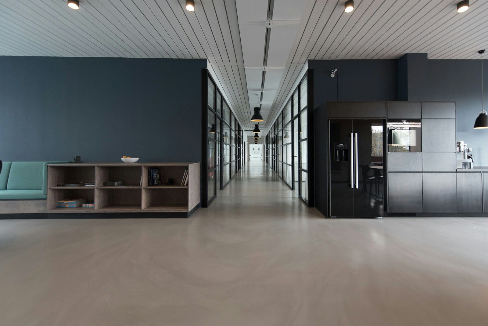
A quieter, sharper frame for ambitious thinking.
Strong typography, restrained color and generous pacing make room for the story without making the visitor work for it.
Selected thinking A visual index
A small collection of directions, systems and digital moments that show how we think about clarity, character and the web.
Design directions
A point of view is a practical tool. These explorations show how we use it.
Strong typography, restrained color and generous pacing make room for the story without making the visitor work for it.
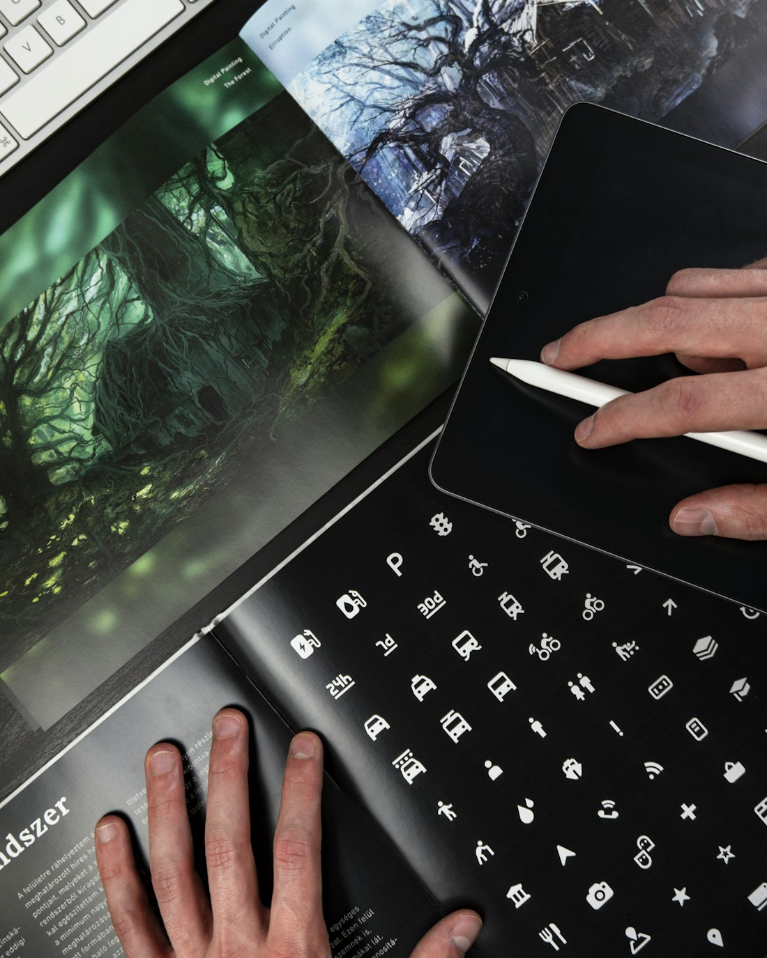
A flexible visual language for a business that wants to feel personal, capable and unmistakably itself.
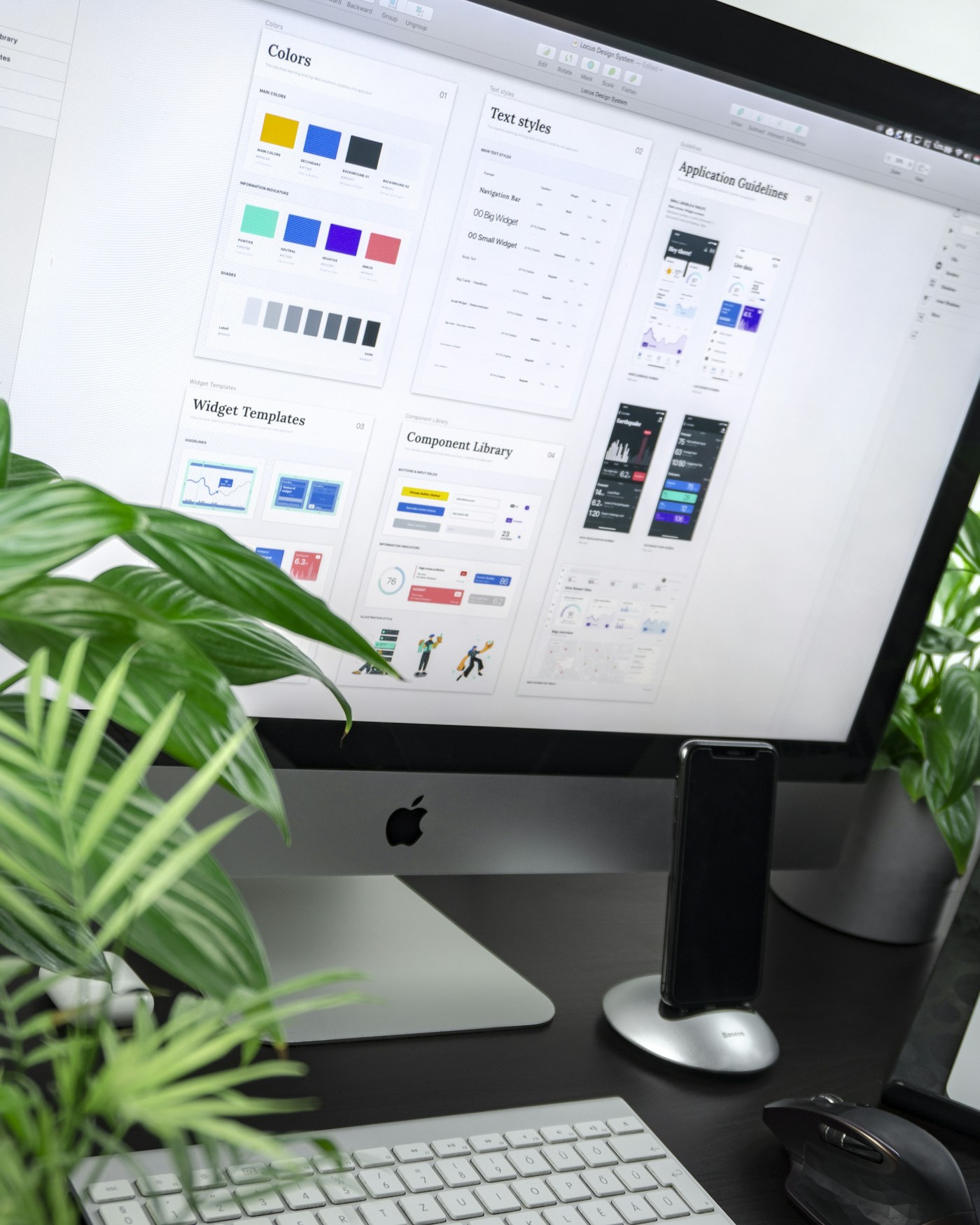
A considered case-study rhythm that helps the right details surface at exactly the right moment.
Built for the next step
A page hierarchy that helps your message land quickly and gives every section a reason to exist.
A practical system of type, color, spacing and imagery that keeps the whole experience in step.
A deliberate experience at every size, with the same level of care from a wide screen to a narrow one.
Thoughtful foundations that leave room for future content, a CMS connection or the next good idea.
Our principles
We edit until the strongest idea has room to be understood.
Small decisions add up to a digital experience that feels unmistakably considered.
Beauty is useful when it makes the next action clearer and the whole system easier to live with.